Work
Develop a visual identity that reflects the team ethos of continually fostering a healthy, energetic, and supportive environment. It aims to feature a clean and modern visual aesthetic that sparks a sense of pride and excitement among current and future members for years to come.
Positive feedback, increase in membership, heightened team spirit, player retention


Founded in 1986 and originally known as the Adirondack Storm, our team is based in the heart of Saranac Lake, NY, nestled within the breathtaking Adirondack Park. We’re a lively, energetic, and welcoming group of women who share a passionate love for the game of hockey. Open to all skill levels, we pride ourselves on fostering a supportive, encouraging, and non-toxic environment where everyone feels at home—whether you’re lacing up skates for the first time or you’ve been playing for years. With a tenacious and courageous spirit, we play for the joy of the game and the camaraderie it brings, always embracing the humor, fun, and connection that come with being part of our team in this small, mountain town.
Since 1986, the women's hockey team has evolved alongside the growing presence and talent of women in ice hockey. Participation has not only increased, but the overall skill level has reached new heights. With each new generation joining the team, their energy and passion continue to fuel its progress.
However, the team’s identity struggled to align with its culture. The name felt disconnected, while the logo and jerseys appeared outdated. It became clear that a refreshed brand identity was needed—one that reflects the team’s growth and resonates with its current spirit and values.
The team formed a brand committee of six members tasked with overseeing the development of the new brand identity from concept to completion. To begin, surveys were distributed to gather preliminary input on what team members felt best represented the team’s identity. Using this feedback, the committee compiled a list of potential new names, which was narrowed down before being presented for a team vote. The result: Adirondack Storm became Adirondack Wild.
With the name finalized, a second survey was conducted to explore specific design directions. The feedback revealed a clear need for a visual identity that embodies the team’s ethos of fostering a healthy, energetic, and supportive environment. The goal was to create a clean, modern aesthetic that inspires pride and excitement, ensuring the brand remains relevant and impactful for years to come.
We also analyzed competitor teams to ensure our brand identity would be distinctive and uniquely reflective of the Adirondack Wild. Rather than adopting an Adirondack animal as a mascot, the team chose to draw inspiration from the region’s natural features.
we drew inspiration from the bold, dynamic elements commonly found in sports logos, which capture the intensity and competitive spirit of the game. The visual identity features strong, assertive typography to symbolize power and unity, while ensuring versatility across a variety of mediums. A bold and distinctive color palette was crafted to evoke excitement and passion. The design assets were intentionally created to be modern, refined, and minimalistic, yet bold, classic, and timeless—striking the perfect balance between energy and enduring appeal.
I collaborated closely with the team’s branding committee to create a visual identity that would carry the team confidently into the future. Using feedback from the initial surveys, I developed several moodboards exploring various design directions for the committee to review. Their constant feedback was essential in shaping the process and driving the design forward.
Ultimately, we refined the concepts to three unique designs:
This winning concept beautifully encapsulates the team’s identity, blending nature, community, and the spirit of the game into a timeless brand.
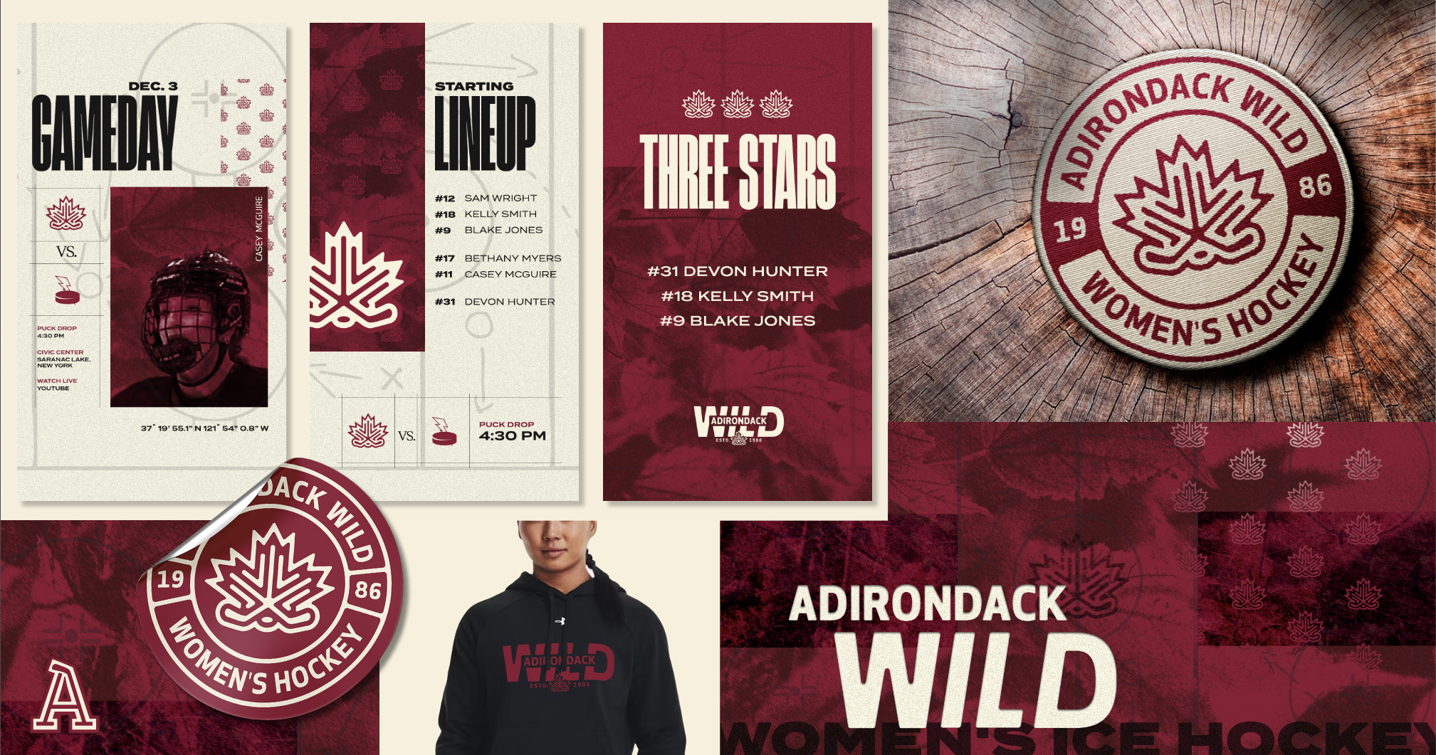
To enhance the brand’s versatility and adaptability, additional badges and patterns were developed, offering a dynamic range of design elements that could be used across various applications. These assets allowed the brand to maintain a cohesive identity while adding creative flexibility for different contexts, from promotional materials to digital platforms.
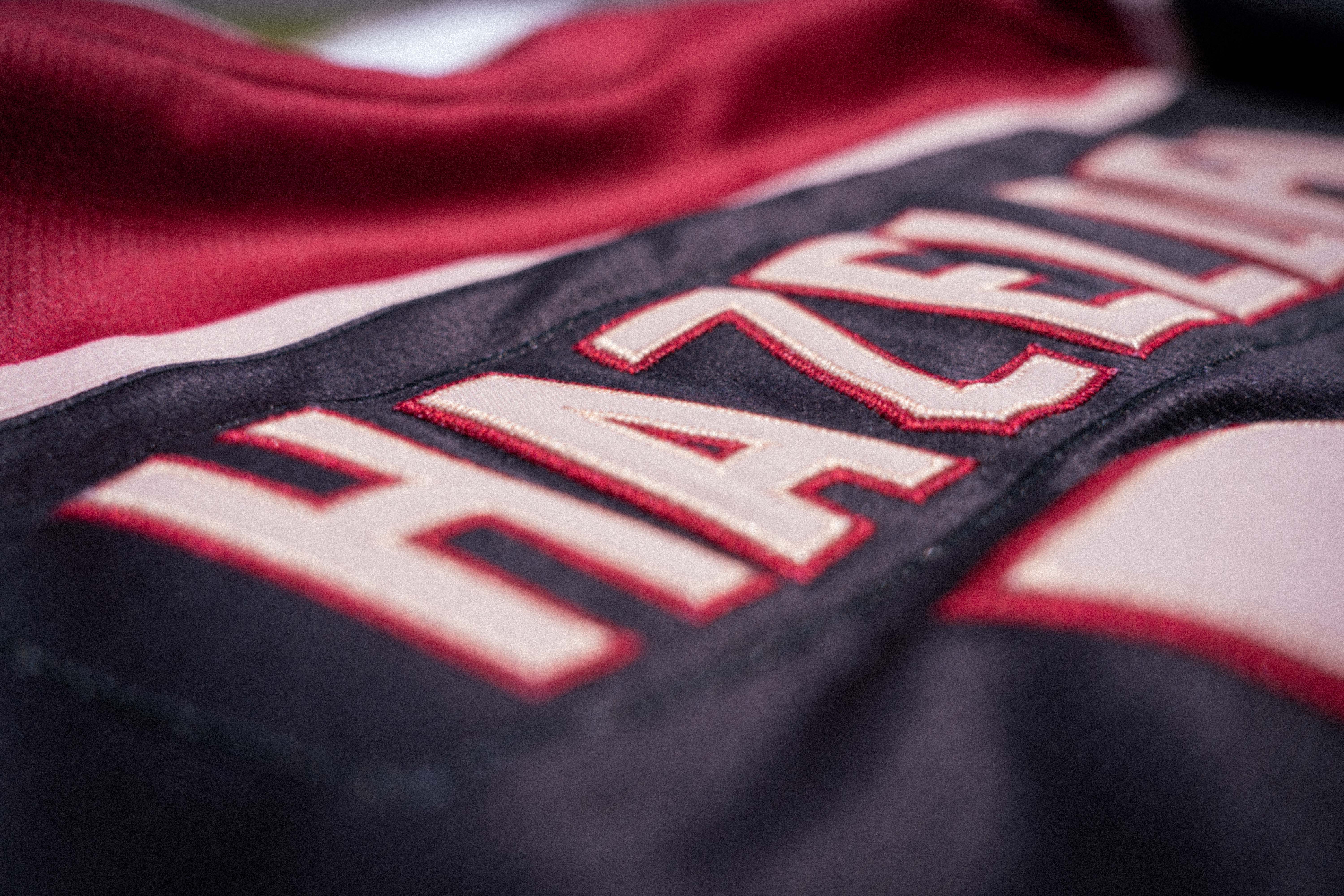
Jerseys and merchandise were thoughtfully designed to bring the brand to life, incorporating the new logo, bold color palette, and supporting design elements. These items not only unified the team visually but also created opportunities for fans to connect with and proudly represent the Adirondack Wild.
The most challenging aspect of this branding project was breaking away from the traditional approach of sports teams, which often rely on animals or mythical creatures as mascots to convey strength, energy, and identity. Instead, we needed to craft a brand that represented the team through an idea or inanimate symbol, which required a more abstract and conceptual approach.
This challenge pushed us to think creatively about how to encapsulate the team’s essence—its values, culture, and connection to the Adirondacks—without relying on the typical tropes of sports branding. The goal was to create a visual identity that felt just as powerful, dynamic, and unifying as a mascot-based design, but through symbols that resonated deeply with the team’s roots and the natural beauty of their environment. This involved exploring metaphors, abstract forms, and iconic elements of the Adirondacks that could visually and emotionally embody the team’s spirit while remaining fresh and distinctive.
Ultimately, the departure from traditional sports logo design became an opportunity to design a brand that stands out in the world of sports, blending originality with a strong connection to the team’s identity and their unique story. The team enthusiastically embraced the new brand identity, seeing it as a powerful reflection of their growth and shared values. The fresh design sparked a renewed sense of pride, with players and supporters alike energized by its modern yet timeless aesthetic. The bold new visuals captured the spirit of the Adirondack Wild, uniting the team under a symbol that truly resonated with their identity and passion for the game. This transformation ignited excitement for the future, creating a lasting connection to the brand both on and off the ice.


